With iOS 13 Apple updated Human Interface Guidelines by enhancing Visual design. Apple added breakthrough changes: dark mode, more design tools, and styling options.
Designers and developers have vast possibilities for creating rich user interface with different modes or themes (dark / light) along with the updated visual system. Apple introduces interface modes, system colors, dynamic system colors, images that support modes and much more.
Apple is always following own way in UI design. They provide a consistent approach for building interfaces while limiting modes or themes to two and giving they own tools: SF Symbols and system colors. All styles are defined in a consistent way with as least as possible ways to override the default behavior.
Dark Mode
iOS 13 enabled interface modes dark and light on the apps. The application should have implemented modes for all UI elements as Apple declares. UI elements can alter its appearance based on system colors and settings.
You can still opt out the application interface mode by defining a property in the Info.plist file: UIUserInterfaceStyle which can have any of those values:
Table 1. Info.plist values for a user interface style
| Property value | UI trait | Description |
|---|---|---|
| Automatic | UIUserInterfaceStyle.unspecified | The app follows the system's interface style |
| Light | UIUserInterfaceStyle.light | The app is forced using light appearance |
| Dark | UIUserInterfaceStyle.dark | The app is forced using dark appearance |
You can find keys for Info.plist file here: Information Property List Key Reference.
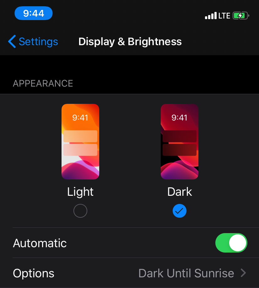
In the settings of iOS 13, a user can define three appearance modes: Light , Dark , Automatic (with options Sunset to Sunrise - dark, else light).
Override a window, view or view controller
The separate view or view controller can have overridden a property overrideUserInterfaceStyle with a value from Table. 1
override func viewDidLoad() {
    super.viewDidLoad()

    overrideUserInterfaceStyle = .light
}
However, it is possible to set using one defined mode, Apple encourages using Automatic mode where appearance is the system one:
Supporting Dark Mode is strongly encouraged. Use the UIUserInterfaceStyle key to opt out only temporarily while you work on improvements to your app's Dark Mode support.
System Colors
Apple introduces System Color with iOS 13.
You can inspect it here https://developer.apple.com/documentation/uikit/uicolor/standard_colors
Colors (systemBlue, systemGreen, systemGray etc) adapt to the mode changes (dark/light), vibrancy, accessibility settings (contrast, reduce transparency). Using system colors benefit your app in looking the same as iOS because these colors can slightly change in new iOS releases.
One example of using system colors on a UITableView with a custom cell.
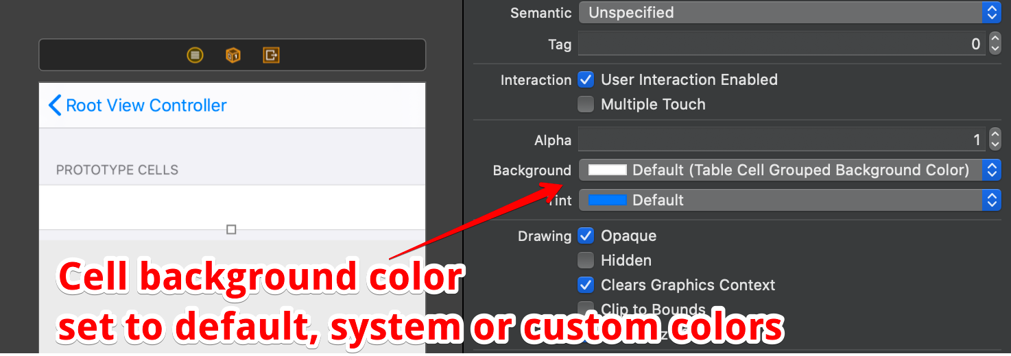
To cover most colors with system styling you need simply choose default, system or custom colors. The simplest way is to use Default settings.
You can define a color with 3 appearances:
Any - for systems without modes support
Dark and Light
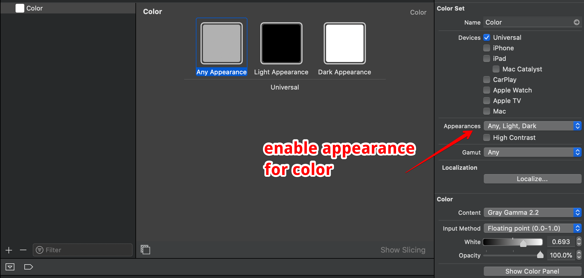
The same applies for images with modes and different image scales
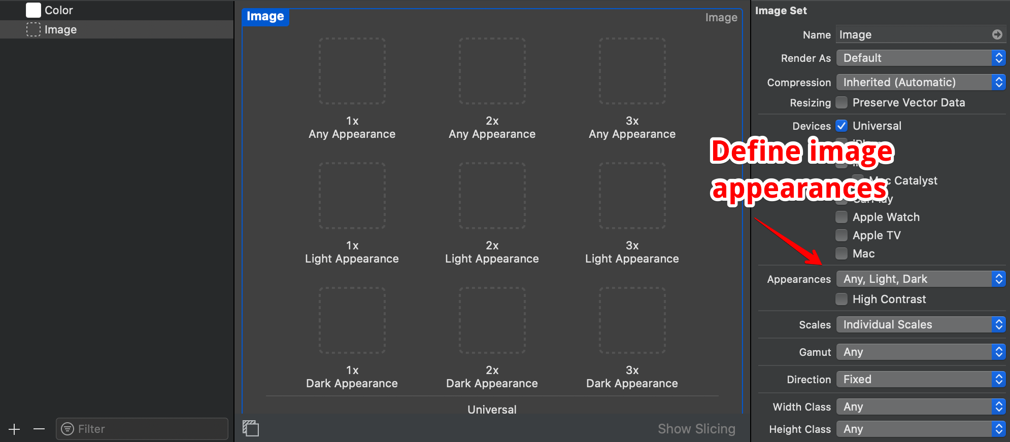
System colors got support of high contrast (from iOS setting - Increase Contrast) and each system color adjusts with accessibility changes with four variants:
- Light
- Light High Contrast
- Dark
- Dark High Contrast


Dynamic System Colors
Another feature is Dynamic System Colors that provides semantically defined colors for different content types: labels, separators and fills.
Table 2. System color properties
| UIColor, class property | Description |
|---|---|
| systemFill | An overlay fill color for thin and small shapes. |
| secondarySystemFill | An overlay fill color for medium-size shapes. |
| tertiarySystemFill | An overlay fill color for large shapes. |
| quaternarySystemFill | An overlay fill color for large areas that contain complex content. |
The similar for labels, fills (color filling different shapes), background colors, grouped content background, separators, link and text. Apple covered all standard UI elements.
SF Symbols
The new thing in UI, a build-in library - SF Symbols. It is a set of icons available for iOS 13+, watchOS 6+ and tvOS 13+.
Symbols support font weights UIFont.Weight : black, bold, heavy, light, medium, regular, semibold, thin, ultrathin with scales: small, medium, and large.

The symbols are SVG files which are vector and renders perfectly under any resolution. And using symbols as simple as images:let image = UIImage(systemName: "multiply.circle.fill")
Additionally, you can configure symbol with a iOS 13 object UIImage.Configuration and UIImage.SymbolConfiguration
let configuration = UIImage.SymbolConfiguration(pointSize: 18, weight: .regular, scale: .medium)
let image = UIImage(systemName: "multiply.circle.fill",
    withConfiguration: configuration)
The visual system and modes provide flexible and straightforward way to develop UI and application. iOS 13 brought the biggest design update for app developers.
Useful links
Creating Custom Symbol Images for Your App - SF symbols
Supporting Dark Mode in Your Interface
Information Property List Key Reference, UIUserInterfaceStyle
